


In what ways does your media product use, develop or challenge forms and conventions of real media products?


Harper’s Bazaar uses feminine typography and uses this magazine convention in order to appeal to its audienceIn my opinion, I think that my magazine front cover will be quite generic to the real media products. By this I mean that the layout of the magazine in general will replicate the other magazines. However, I want my front cover to be distinguished and different, in order for it to stand out to my target audience, and for it to receive a preferred reading. However, I also want to challenge the concept of under representation in the media of certain social groups, and since my chosen genre is jazz, I want to represent the wider spectrum of jazz fans, rather than the minimal stereotype, such as men, and the elderly.


I think that this magazine front cover is very different to the ones in the same genre, as jazz magazines are quite rare to find and the fact that women are hardly ever on the front cover also makes my magazine stand out from others of its kind. Also, the front cover is different from most magazines both because of the picture on the cover and the typography. Many magazines establish their typography as their own, and this varies depending on their target audience. For example, the lifestyle magazine Harper’s Bazaar – aimed at women, uses thin, handwritten, feminine typography as this is suitable for its audience. Instead of using feminine typography, I tried to be as inclusive as possible with my font, and therefore chose a standard block font in order to avoid showing preference to a particular gender. The picture on my front cover is minimal and androgynous, which plays on jazz as a male dominated genre, but it also challenges the average conventions on magazines in general as the covers are colourful and bright in order to attract readers’ attention. I think that this interesting contrast will work toward the benefit of the magazine, rather than being unsuccessful. The reason for this is that since the general music magazine conventions are being challenged, the readers will become more drawn to my magazine, and contemplate buying it. However, I felt that if I did the opposite, it would be more likely to attract attention as people will find the simplicity and the minimalism interesting. Also, the simplistic nature of the cover is sophisticated and smart, which is similar to jazz, and I felt that if the front cover and the genre corresponded, it would create more of a dynamic and interesting effect. I also stuck to the average magazine convention by creating a consistent colour scheme for my magazine. The reason for this is that many magazines stick to a colour scheme on the front cover in order to allow the page to look coherent. I looked at magazines like vogue that stick to a concise colour scheme, but ultimately I was inspired by the simple, inclusive colour scheme of black, white and red.


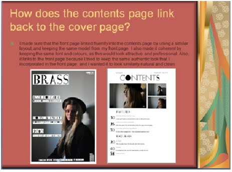
I tried to stick to the minimalism of the front page to continue into the contents page, this makes the magazine more coherent, and it all ties together well. Also, I think that with my contents page being different from other magazine contents pages makes it stand out for all the right reasons, and will seem more intriguing and attractive to my selected target audience. This makes the magazine much more personal to the audience and they will immediately feel as though they have been kept in mind during the production on the magazine. I tired to keep the same pictures from my front page so this would add to the coherency that I wanted. By this, I mean that I used ‘taster’ pictures from my double page spread, on my featured artist to give the readers more of an idea as to what was going to be featured on the double page spread. I also had a minimal use of colour in the contents page as this would make it seem sophisticated, and apply and adapt to the lifestyle of the target audience for the music magazine. I wanted to make the contents page as easy to understand as possible and I therefore used colours that are easy to read, and also dividers for different stories. With the page numbers and article pages I tried to make the numbers very clear to the reader by using a colour that would be easy to read and also a colour that has no gender specification and is coherent and fits with the main colours that are being used extensively through the magazine.
I looked at other content pages of music magazines, such as ‘Q’ which gave me ideas as to how I should lay out my contents page, and what I would need to do to make it easily accessible and understandable. I also looked at colour schemes and picture layout to gain a bit of knowledge on how I should work with my own magazine. From the magazines I looked at I learned that there weren’t a lot of pictures, as to divert from making the contents page too busy, which could possibly make it difficult to understand. In that aspect, I don’t think that I tried to challenge the norms, however I managed to make my content page stand out by using a minimal amount of colour, and choosing a simplistic layout while still sticking to the ‘normal’ contents page layout. I thought that the layout and use of colour in Q magazine has always been conventional, and the magazine has also managed to always stay true to the ‘rule of three’ – this means that they stick to three colours to recreate throughout their front cover and contents page. This ‘rule of three’ is a successful tactic that ensures that the look of the magazine is aesthetically pleasing to the audience, and this is also what I tired to do with my own magazine. I chose red, white and black because I felt that these colours would definitely appeal to my chosen audience, but moreover, the three colours could also look appealing to people of other genders and age groups, expanding my magazine’s readership.
I used the website: http://www.kuler.adobe.com/ to come up with suitable colours that would make my magazine attractive and coherent to my audience, but would also make my magazine suitably marketable by the chosen institution. I tried to stick to the minimalism of the contents page to continue into the double page, this makes the magazine more coherent, and it all ties together well. Also, I think that with my double page being different from other magazine double pages makes it stand out for all the right reasons, and will seem more intriguing and attractive to my selected target audience. I tired to keep the same pictures from my front page so this would add to the coherency that I wanted. I also had a minimal use of colour in the double page as this would make it seem sophisticated, and apply and adapt to the lifestyle of the target audience for the music magazine.I looked at other content pages of music magazines, such as ‘Kerrang!’ and ‘Q’ which gave me ideas as to how I should lay out my double page, and what I would need to do to make it easily accessible and understandable. I also looked at colour schemes and picture layout to gain a bit of knowledge on how I should work with my own magazine. From the magazines I looked at I learned that there weren’t a lot of pictures, as to divert from making the double page too busy, which could possibly make it difficult to understand. In that aspect, I don’t think that I tried to challenge the norms, however I managed to make my double page stand out by using a minimal amount of colour, and choosing a simplistic layout while still sticking to the ‘normal’ double-page spread layout. For my double page spread, I wanted it to encompass all of the elements that I put forth in my cover page and contents page. I used the same model and same font so my magazine could be coherent and well put together, as well as keeping my colour scheme simple and minimal, in order for it to appeal to my target audience. I also chose a minimalist colour scheme in order for my magazine to be coherent and flexible.
How does your media product represent particular social groups?
I stuck to the average magazine convention by creating a consistent colour scheme for my magazine. The reason for this is that many magazines stick to a colour scheme on the front cover in order to allow the page to look coherent. I looked at magazines like vogue that stick to a concise colour scheme, but ultimately I was inspired by the simple, inclusive colour scheme of black, white and red. I think that since my music magazine is on the Jazz genre, it would be stereotypically directed at the male audience; however, I want to create a magazine that does the opposite. Although there are many talented women in jazz, I think that they are overshadowed by the patriarchy associated with the genre. By creating a music magazine that is as equally representative of the female, as it is the male, I will get the ‘preferred reading’ that I am after. Also, I want to adapt the mast heads and the layout so I can get my wanted audience to find my media product attractive and interesting. I will do this by choosing a specific model and also, by designing my layout to create the wanted effect on my audience. I tried to make my contents page follow the conventions of my front cover, which were sophistication, minimalism and class, which were how I wanted to represent my chosen genre, and those are the types of individuals I want to target through my magazines.
I figured that my target audience would mainly consist of middle class, jazz enjoying females, and I therefore strived to emulate their character and lifestyle through my magazine, so I could get the preferred reading that I wanted. I chose the same collection of pictures as my front page, in order to fully tie together the message that I wanted to convey through my magazine. I wanted women to feel empowered and represented when they read my magazine, and I thought it was very important to have this sense of sensibility and class about my magazine, which is the main ways in which I want to attract readers. I tried to appeal to my chosen target audience primarily through the layout, colour and photography used in my chosen institution. The title of the double-page spread article is very straight-forward and specifically targeting of the audience that I want to appeal to. The title is ‘Jazzy Izzie’ and with that, I wanted to make a double page that would directly link into the genre that I wanted to represent in my magazine. With the layout I wanted to stick to the representation of jazz, and therefore I tried to keep the page sophisticated and mature with no extroverted fonts or colours. For my double page spread, I am trying to make the design and layout interesting in order for it to interest my reader, and grab their attention. Also, I am using pictures from my photo shoot that the readers haven’t seen before, which also adds to the originality and excitement of my double page spread. Ideally, double-page spreads are supposed to be engaging – this includes and interesting story, nice pictures and an intriguing lay-out, which I am also trying to include in my own double page spread. I feel that as well as this being true of the jazz genre, it is also true of the middle-aged target audience that I have to appeal to. Looking at different double page spreads really allowed me to explore how to use font and colour in a way that would be informative and appealing. What I liked the most was the Q front page, which seemed really regal and positively representative of the featured artist, as the photography overwhelmingly conveyed her high positioning on the musical hierarchy, and her ultimate position of power. I wanted to incorporate this into my final double page spread because I felt that this would be an extremely attractive way to portray women to an audience that would mainly be constituted for by women.
What kind of media institution might distribute your media product and why?


IPC media cater to magazines of a varying nature, and therefore have experience in attracting audiences to magazines of all kinds.I think that I would want my media product to be distributed by an experienced institution. The reason I would want an experienced institution is due to the rarity of a jazz magazine, and I feel that because of this it needs to be marketed specifically in order to appeal to the audience that I have in mind. This would make it easier to market my jazz magazine to a wider audience, and it would also enable the magazine to recognize females as an audience. I would like an institution such as IPC Media to distribute my magazine because they are experienced in their field; they are also the UK's leading consumer magazine publisher with approximately 90 brands and selling 350 million magazines every year. This shows that they know how to market my magazine appropriately in order for it to become popular and they are also aware of how to target my chosen target audience correctly. My chosen institution is also popular on an international scale, which could allow my magazine to become popular on a larger scale, with an international audience.
Also, IPC media also offer online subscriptions of magazines, and make soft copies of magazines available to people everywhere. This shows that my magazine could gain a huge readership from the fact that IPC media is the most advanced media distributor in the country, and is also respected internationally. Due to the complexity and rarity of my chosen genre, I think that the distribution of the magazine will have to be quite specific and tailored to my target audience. Therefore I would like an experienced institution such as IPC media to be the distributors of my jazz magazine. Also, I would like to have my magazine sold in magazines and other major retailers and bookstores like W.H. Smith and Waterstones, this makes my magazine accessible to people in all parts of the country, because these retailers are available nationally, however, I would also like my magazines to be sold at jazz clubs and bars because this would ensure that the magazine is directly associated with it’s genre, as well as distributing it directly to fans of the genre, that could enjoy and appreciate my magazine, which is what I want. Also, by distributing my magazines at a wide range of jazz clubs and bars, this makes my magazine nationally successful and I can reach a wider audience across the country, and maybe even develop my magazine internationally using the institution IPC Media as help. Subscriptions to my magazine should also be made widely available to the audience as this could increase its sales and popularity.
Also, I would want my magazine to be in paid circulation. This means that the magazine is sold to readers for a price, either on a per-issue basis or by subscription, where an annual fee is paid and issues are sent by post to readers. By having paid subscription for my magazine, it would be following the norms and generic codes of magazines around the world, and the distribution process would also become much more understandable to the audience, who would find the simplicity of the distribution process attractive. Because of the specific mature of the audience that I want to attract. Therefore, I want a well-known, professional institution like IPC Media to distribute the magazine. I would like to have my magazine sold in magazines and other major retailers and bookstores like commercialised book stores and major supermarkets like Sainsbury’s and Tesco, this makes my magazine accessible to people in all parts of the country, because these retailers are available nationally, however, I would also like my magazines to be sold at jazz clubs and bars because this would ensure that the magazine is directly associated with it’s genre, as well as distributing it directly to fans of the genre, that could enjoy and appreciate my magazine, which is what I want. I would like an institution such as IPC Media to distribute my magazine because they are experienced in their field; they are also the UK's leading consumer magazine publisher with approximately 90 brands and selling 350 million magazines every year. This shows that they know how to market my magazine appropriately in order for it to become popular and they are also aware of how to target my chosen target audience correctly.
Who would be the audience for your media product?


By looking at my magazine, it is clear that the audience for my magazine are females; this is clear through the model that is on my front cover, as she will appeal to the women who I am specifically targeting. Although my magazine is generally targeted at women, I tried to also make it appealing to the male audience but choosing colours that would seem appropriate to both genders. I thought that red. Black and white would apply to most people, as they are not stereotyped towards particular genders. Also, the model is dressed androgynously in order to appeal to men and women, as well as making my magazine look interesting to the audience. I have used the bold, block fonts and the minimal colours that are incorporated in a male magazine, with the young, female model that is often used to promote female magazines – such as GQ and Harpers’ Bazaar.
- GQ uses red, red, white and black as their primary colours, and they also used simple fonts to address their mainly male audience.
- Harper’s Bazaar, however use more feminine colours and fonts, and also a female model to address their audience of that gender.
The audience for my media product are mainly women, from a working and middle class background and are of an older age, however, in the way that I have designed my magazine, I would also like to attract a wider audience of younger women. The reason for this is that the more people I have enjoying my media product, the more successful it’s going to be. Also, I think that I have managed to connect with a wider audience through the use of colour, layout and typography in my magazine. The way I have made this possible is through the use of gender neutral colours that will not create an unattractive effect on men. Also, I have tried to make the layout coherent and tangible to all gender and ages in order to break that certain barrier. The way I have done this is by using typography that isn’t too feminine, but at the same time not too boring. Also, I have used a young model to attract a younger audience that will be able to relate to the featured artist due to similar age. However, I have also managed to remain connected to my core audience because of the use of a female model that will increase their sympathy with the magazine, and I have also kept the layout of my contents page similar to that of my front cover – clean and sophisticated. Therefore, I have incorporated the elements of both male and female magazines in order to create a magazine that suits both genders.
How did you attract/address your audience?
As my chosen genre and the audience that I want are quite different, I am trying to appeal to them through the look of my front page. I want my audience to immediately find my magazine attractive, and the only way that I can do this is to appeal to them through the way my front cover looks. I have chosen a female model on my front cover, to exemplify the fact that I would like to gain a predominantly female readership, also, I tried to further emphasise the need for a female audience through my buy-lines and mast heads. However, I have created a quite androgynous look for my model on the front page, and the reason for this is to play on the fact that jazz is a ‘male’ genre and I wanted to represent women in this genre, as I feel that they have done a great deal for jazz music. The colour of my front page is heavily black and white, with minimal colour. This is to make my magazine look interesting, and increase the attractive nature of it. It is also for it to catch the audience’s eye and stand out from all the other, colourful magazines that will be on the shelf. I also felt that by using a female model for my front cover I was attracting the audience that I wanted, as they would feel represented and appreciated.
Also, I’d want them to feel that within the jazz genre, women are represented equally to the input they have in the actual music. Although I tried to engage my audience through visual means such as layout, photography, typography and colour scheme, I also though it was extremely important for the audience to be attracted to the core message of the magazine and I thought that the front page should fuel this attraction through it’s simplicity and it’s allowance for easy navigation through the magazine. I’m attracting my audience by making my layout look more appealing and simplistic, as this will appeal to my middle-class, female audience. Also, the text is sophisticated. I looked at other double-page spreads of music magazines, such as ‘Kerrang!’ and ‘Q’ which gave me ideas as to how I should lay out my double-page spread, and what I would need to do to make it easily accessible and understandable. I also looked at colour schemes and picture layout to gain a bit of knowledge on how I should work with my own magazine. From the magazines I looked at I learned that there weren’t a lot of pictures, as to divert from making the double page too busy, which could possibly make it difficult to understand. In that aspect, I don’t think that I tried to challenge the norms, however I managed to make my double page stand out by using a minimal amount of colour, and choosing a simplistic layout while still sticking to the ‘normal’ double page layout.
What have you learnt about technologies from the process of constructing this product?


I have learnt many things with the technicality that is incorporated in making a magazine, I have gotten more comfortable with using InDesign and Photoshop, and I think that I know my way around both programmes for future references. Also, I think that when working with my contents page and double-page spread I will be more comfortable with using the programmes. I have also learned how to control my layering when using InDesign, as this will enable me to work on my magazine without complications and difficulties. Another thing I have learned when it comes to technology is playing and experimenting with fonts and layouts, as I found my main challenge was to choose a font that I felt was most compatible with my front page. I did this by going on many different websites to look for fonts, and to take other magazines into consideration and use their lay outs as inspiration for my own.
I think that I have made a huge progression from my preliminary task when it comes to technology, because I have familiarised myself with the different tools that could help me with creating a more professional looking front page. I have become more fluent in using layers, and I now find it easier to navigate a number of layers, as it helps me with being organised and lets me visualise all the components that are incorporated into my magazine. I have managed to use different tools, such as the Ellipse Tool and the Gradient Swatch Tool to create a preferred effect. Also, by using different colours in the Swatches, I have managed to successfully model my own front cover on the Q magazine’s front cover. I have really developed my skills with using InDesign and Photoshop, and I have become more fluent with its use during the production of my front page and my contents page. I have learned how to use layers properly in InDesign, and how to manipulate my photographs in Photoshop using the colour settings. Also, I think that I have become more used to adapting my skills that I learned from working on my preliminary task to my Music Magazine contents page. This has allowed me to develop my skills, and make my contents page look more professional, and link it to my audience. I have also made the production easier for myself by creating a mock-up contents page on Microsoft word, and this made it easier for me to adapt this into InDesign, since I was relatively new to its use.
By the final trial when making my contents page, I had learned how to use InDesign well, and was able to design my magazine in accordance to other magazines that I used as inspiration and that I found attractive. I experimented especially with colour when using InDesign because I wanted to create an effect that would make my magazine attractive as well as coherent. I used the swatches tool to create different experimental shades of grey in order to break out of the routine of using black, white and red too much – the use of grey also neutralised the colour palette. I have really developed my skills with using InDesign and Photoshop, and I have become more fluent with its use during the production of my front page and my contents page. I have learned how to use layers properly in InDesign, and how to manipulate my photographs in Photoshop using the colour settings. Also, I think that I have become more used to adapting my skills that I learned from working on my preliminary task to my Music Magazine contents page. This has allowed me to develop my skills, and make my contents page look more professional, and link it to my audience.
Looking back at your preliminary task, what do you feel you have learnt in the progression from it to the full product?
During the progression through my preliminary task, I have learned and improved many qualities such as the technicality behind composing a magazine and how to layout and plan a magazine production. I think that my photographs have become much more intricate and were taken to correspond with my chosen musical genre and they were also of better quality, as I had time to use a better camera and to plan the shoot. I also became much more comfortable with using InDesign and Photoshop, as I felt that during the preliminary task, it was a little difficult to get used to all the short-cuts on the programmes. I think that the general ‘look’ of my magazine has also become more professional and sophisticated. Compared to my preliminary contents page, I think that my Music magazine’s content page is far more interesting and adapted to my readers’ interests.
Also, I think that I knew what I was doing, and was more comfortable with using InDesign when working on my contents page for my Music magazine. I also think that I was more experimental and outgoing with my music magazine’s content page because I used a wider range of fonts, a basic colour scheme and varied photographs. I think that this makes my contents page tie in with my front cover more coherently, and it also attracts my target audience. With my preliminary contents page, I didn’t create a mock-up for me to get ideas and inspiration from, but for my music magazine’s contents page the sketch up that I created on Microsoft word enabled me to shorten my production time, which proved effective – instead of wasting time when using InDesign and creating a bad quality contents page. I have also made the production easier for myself by creating a mock-up contents page on Microsoft word, and this made it easier for me to adapt this into InDesign, since I was relatively new to its use.
Compared to my preliminary contents page, I think that my Music magazine’s content page and double page spread is far more interesting and adapted to my readers’ interests. Also, I think that I knew what I was doing, and was more comfortable with using InDesign when working on my double page for my Music magazine. I also think that I was more experimental and outgoing with my music magazine’s double page because I used a wider range of fonts, a basic colour scheme and varied photographs. I think that this makes my double page tie in with my front cover and contents page more coherently, and it also attracts my target audience. With my preliminary contents page, I didn’t create a mock-up for me to get ideas and inspiration from, but for my music magazine’s contents page the sketch up that I created on Microsoft word enabled me to shorten my production time, which proved effective – instead of wasting time when using InDesign and creating a bad quality contents page and double-page spread. It is obvious that my progression has been successful from my first trial to my final magazine production. I think that I improved in terms of the colours that I decided to incorporate; however, I also think that the layout has become more sophisticated and professional looking. I feel that the fact that I have become quite comfortable with using technologies such as InDesign and Photoshop has allowed me to become much more experimental with the way that I have executed my magazine in the final trial.


